Friday, 14 April 2017
Thursday, 6 April 2017
Final Ancillary tasks
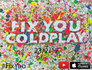
Poster:
We chose to leave the 'Fix you' and 'Coldplay' plain what as it contrast the paint all around it, because in our music video only the people with depression can see the paint where as others just see the world as normal e.g. the public see Charlie and Annabel in a plain white tshirt whereas they see themselves with paint on. I decided to add a release date on Photoshop as it follows the normal conventions of a music video, I chose a plain black don't see that it doesn't draw the attention away from the paint and main title. I also include a hashtag in the corner, that is because our target audience is teens and young adults so social media is something commonly used, if our music video was to actually be for real a hashtag would get the public advertising your video for free on sites such as Twitter. In the bottom hand corner there are two icons, YouTube and Apple iTunes, I decided to include these because from our audience research video they said these are the most common ways in which they consume music videos, therefore if we were to release our music video on there we are likely to get more interested.
Digi Pack:
The idea for our digipak is to have it mainly plain white with nothing but the a few paint splatters and the album title and the song names on the back. The idea of having it white is so the person who has purchased the album can colour the album in themselves however their heart desires. We thought this was a cool idea as art such as colouring is often used as a form of therapy for mental health issues such as depression. We choose the colour black for the fold especially on the inside of the Digipak, on the left hand side the pink paint splatter represents Charlie and the yellow represents Annabel, the two colours are so close yet separated from the black line, this gives out the idea that many people have depression all around us but we don't break down the barrier to find out and help those. We chose to keep the the song title names in black rather than a bright colour to show the seriousness of the issue.
Overall, I think out Poster includes many conventions you expect to see in an album poster such as a release date, the album title and artist in big letters, and a hashtag and icons such as a YouTube logo of where you an expect to find the music video. However, most album covers have a gripping interesting images that draws you into looking at the poster, this is something our poster challenges as we don't have one of them. Our Digipack conforms with certain conventions such as the album title and artist in big letters, the layout and folders of the poster, and the song titles on the back. However, our idea is very unique and I haven't came across a single Digipak with the idea of colouring in and creating the Digipak your own so here we challenge the conventions of your everyday Digipak's.
Subscribe to:
Comments (Atom)


